Ship of Tools
Color stories do heavy lifting. They impart mood and meaning. They assist wayfinding...guiding attention from here to there as we transition from scene to scene.
I'll be honest though...the HOW of designing color stories is something of a mystery to me. I know what I like, of course, but arriving at what I like is another thing all together. The Adobe color tool is helpful but it also illustrates my unstructured approach to selecting colors. Notably it reveals my propensity to lean towards analogous color schemes.


Next week, we'll port our research sketches into Illustrator, but for now we have to finalize our design and understand color stories. There is a lot to do and much to learn.
As for my research, I chose to research Norwegian art forms. Your standard American mutt, I have one set of great grandparents who emigrated from Norway. When I was a young child, my grandparents brought out heirlooms passed down through that side of the family. Examples of Norwegian textile art and sterling silver jewelry, these artifacts made a lasting impression. I particularly remember Grandma Katherine's pin depicting a Viking longboat, so I started there. In the research, I found myself drawn to the long oars that powered these boats. Their dimensions were so unexpected. I came across an 11th Bayeux Tapestry depicting longboats crossing the English Channel, and that find kicked off a side explorations into Norwegian tapestries.
From the websites Absolute Tapestry and Norwegian Textile Letter, I learned that tapestry was Northern Europe's dominant visual art form from 1550 to 1800, overshadowing sculpture and painting. Lacking a large patron base in Norway, small tapestry studios formed. These studios stood apart from Europe's great tapestry workshops, not just in scale and patronage but in who the artists were. Whereas only men were invited to weave in the great tapestry workshops of Europe, women took up the role of weaver in Norway. Having the responsibility of preparing the threads and weaving the tapestry gave women control over texture, color, and content. As painting and sculpture gained prominence in the 1800s, tapestry remained the dominant visual art in Norway as its materials for the media and required technical skills remained more accessible to the population. As a consequence, it was within tapestry that Norwegians explored realism in the visual art form. Norwegian women took ample part of this exploration projecting their singular experiences and perspectives through the art form.
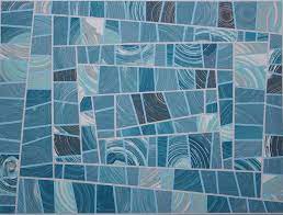
The Absolute Tapestry website contains a treasure trove of color stories...illustrating how they work in a medium that's probably less familiar to most contemporary audiences. Monochromatic, complimentary, split complimentary, triadic, and analogous, these color harmonies play out on the strings of tapestry, dyed and woven with intention.
The contemporary tapestry ribbons of Unn Sonju often play with monochrome palettes.
 by Unn Sonju") |
| Sky Pockets (1996) by Unn Sonju |
Several tapestries played with complimentary harmony of blues and yellows as seen in the work below. For this work tapestry Melkeveien (1898) translated as The Milky Way, Frida Hansen received a gold medal in the Paris Exposition of 1900.
 (1898) by Frida Hansen") |
| Melkeveien (1898) by Frida Hansen |
In the contemporary tapestry The Bench (2018), Dorthe Herup uses a square palette to depict Danish sailors from her childhood, men "who could tell stories from around the world if you took the time to listen". The rainbow of colors hints that there is more than meets the eye from these figures who sit on a sidewalk bench against a red brick backdrop.
 |
| The Bench (2018) by Dorthe Herup |
Below are more examples of each palette.
Monochromatic


Complimentary


Split complimentary


Triadic


Analogous (my personal favorite)


But for now this reflections on this set of tools is enough for one post. Enjoy.


Comments
Post a Comment